outside-in-approach
Our content follows the “outside-in-approach”. We design the text and images based on in which framework they were meant to be integrated in. This means the way we structure our text and build our images needs to adher to the limits of the surrounding layout.
“inside” design guidelines
character limits
readability & spacing
- None-grammatically relevant Metrics/Glyph are always spaced apart.
Examples:
150 ml (
150ml) 35,50 € (35,50€) 10 % discount (10% discount)
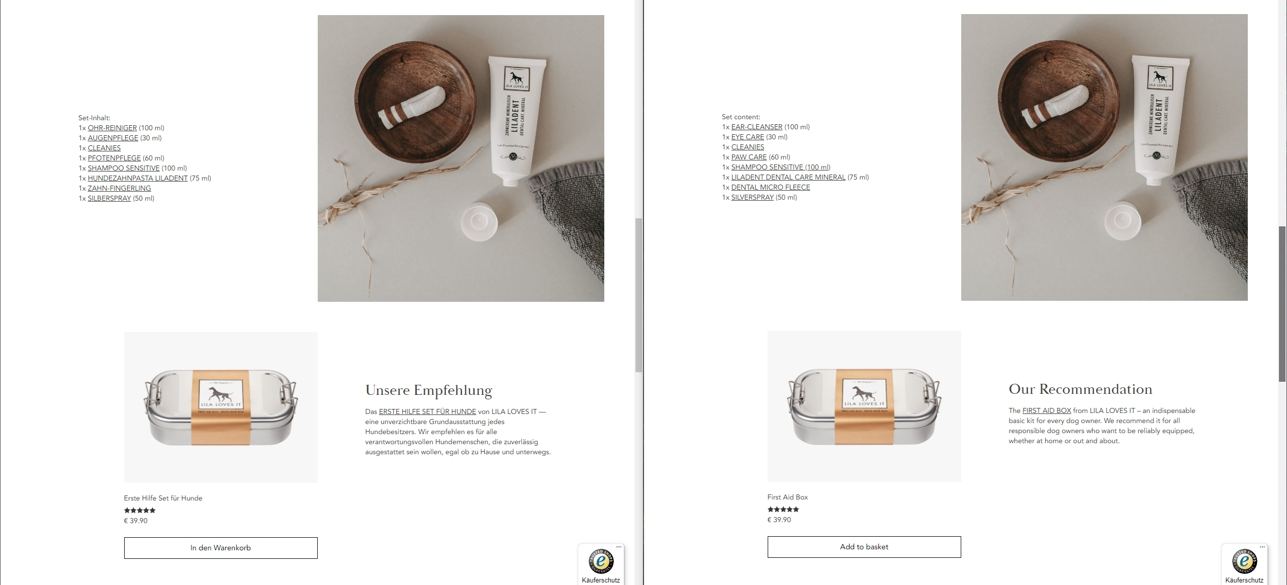
product inline & set content referencing
Headers can be descriptive. Baskerville headers should never be CAPsed. Inline texts need to mention the exact product name in CAPS format. The brand name should either not be included or visually spaced. This can be achieved by following with “from” or “by” or lead with “favoroite” or “popular” (i.E. “FIRST AID BOX by LILA LOVES IT”).